Image-based overrides for Flexible icons
Totara Learn 9 introduced the Flexible icons API to modernise the way it's possible to work with icons in Learn. While the overview document discusses overriding icons using the default font based set, in this document we'll discuss overriding an icon using an image file (for example from a legacy theme icon override).
In both examples we'll update the 'loading' icon in an imaginary custom theme based on Roots called 'Kakapo'. We'll provide command -line examples as we go based on using a Bash shell in a Unixy environment such as Ubuntu Linux or OSX. Note that while image overrides in a theme which do not have a flex icon equivalent are still rendered using pix_icon legacy icon overrides in the pix, pix_core or pix_plugins directories will not be applied as the Flex icon API will always use a Flex icon.
Using an image (or standalone SVG) as an icon
Let's assume we have a legacy animated GIF we want to serve instead of the font-based default inherited from Roots. First up we'll create a flex_icons.php file under the pix directory of our theme:
$ cd /path/to/totara/dirroot
$ cd theme/kakapo
$ mkdir pix
$ touch pix/flex_icons.php
Next we need to open up the new file and tell the Flexible icons API we want to override the icon with the 'loading' identifier (you will find a full list of icons and their identifiers in your Totara installation at <wwwroot>/elementlibrary/flex_icons.php or can find the identifier of an icon by inspecting the data-flex-icon property in its rendered markup). We do this by adding an $icons array entry keyed by the identifier of the icon to override:
<?php

// Copyright info would go here.

$icons = [
	'loading' => []
];
Next we need to define the template which should be used to render our override (if none is defined the Flex icons API will fall back to the font-icon default 'core/flex_icon'). Note that we use the Mustache template identifier as the value here:
<?php

// Copyright info would go here.

$icons = [
	'loading' => [
		'template' => 'theme_kakapo/image_icon'
	]
];
Currently there is no 'theme_kakapo/image_icon' template so let's create one:
# The current working directory is: theme/kakapo
$ mkdir templates
$ touch templates/image_icon.mustache
Inside the template we'll add any markup we need to render our icon.
It is very important that you don't forget to include the flex-icon class on the container used by JavaScript to target flex icons e.g. for removal AND the data-flex-icon data property which should have the value of the context variable 'identifier' and is automatically passed in by the API. This data property can be used to identify the icon ID from the markup and may also be used to target the icon for icon specific styles.
Lets create a containing span with the flex icon identifier and inside that another we'll use to display our icon:
{{! Copyright info would go here. }}

<span data-flex-icon="{{identifier}}"><span class="image-icon"></span></span>
We need to think about accessibility of our icon so we'll add the 'aria-hidden' property on the element which will display the icon and set it to 'true' so that it is ignored by assistive technologies. While icons should not be used solely to communicate information to end users there are legacy situations in the codebases where this happens. In these instances an <img> tag's 'alt' property was used to communicate the icon's meaning to users of screen readers. The Flexible icons API is backwards compatible with these uses providing a template context property of the customdata object named 'alt'. We'll support this in our template by outputting its content to a span which we'll hide from everything except screen readers:
{{! Copyright info would go here. }}

<span data-flex-icon="{{identifier}}"><span class="image-icon"></span>{{#customdata.alt}}<span class="sr-only">{{.}}</span>{{/customdata.alt}}</span>
The legacy icons API also provided a title attribute so we add that in on the icon span also:
{{! Copyright info would go here. }}

<span data-flex-icon="{{identifier}}"><span class="image-icon"{{#customdata.title}} title="{{.}}"{{/customdata.title}}></span>{{#customdata.alt}}<span class="sr-only">{{.}}</span>{{/customdata.alt}}</span>
All our icons using the image_icon template will have some common styles applied via the image-icon class we've added but we'll also need to define default icon-specific classes in our flex_icons.php file which will be provided in the template context in the 'classes' property (all items declared in the icon's 'data' array in its flex_icons.php entry will be available as template context variables). Lastly we should also provide a way for ourselves and other developers to pass through custom classes to be applied to a particular icon instance. Any data passed via renderIcon() will be available as properties of the 'customdata' context variable:
{{! Copyright info would go here. }}

<span data-flex-icon="{{identifier}}"><span class="image-icon{{#classes}} {{.}}{{/classes}}{{#customdata.classes}} {{.}}{{/customdata.classes}}"{{#customdata.title}} title="{{.}}"{{/customdata.title}}></span>{{#customdata.alt}}<span class="sr-only">{{.}}</span>{{/ customdata.alt }}</span>
Let's add that icon-specific class to our entry in the theme_kakapo flex_icon now:
<?php

// Copyright info would go here.

$icons = [
	'loading' => [
		'template' => 'theme_kakapo/image_icon',
		'data' => [
				'classes' => 'image-icon--loading',
		],
	]
];
I've used a Block Element Modifier naming convention but you're free to use whatever convention you prefer.
To check things are working so far we can open up a Totara Learn page in our browser (any page will do) and purge the caches. Once that's done we can use our browser's JavaScript console to render the new icon and print the output to the console. Open the developer tools in your browser, paste and execute the following snippet in the JavaScript console:
require(['core/templates'], function(templates) {
    templates.renderIcon('loading', {alt: 'Alt text here!', title: 'Title text here', 'classes': 'custom-class-here'})
      .done(function(renderedHTML) { console.log(renderedHTML) });
});
You should see the outupt:
<span data-flex-icon="loading"><span aria-hidden="true" class="image-icon image-icon--loading custom-class-here" title="Title text here"></span><span class="sr-only">Alt text here!</span></span>
Now we've got our HTML structure rendering out lets add some CSS to display our legacy image. We'll create a dedicated LESS file in our theme for our image-icon specific styles. If you've decided not to work with less and just stick with plain CSS you could do that also. Let's say we've created a theme/kakapo/less/totara/image-icons.less file and a corresponding @import directive in our main .less file so that its compiled when we run `grunt css`. In our new Less file we'll add a rule-set to target all icons using our new template and set the size to match other icons in Totara Learn:
.image-icon {
	// Let's give it a loud background while we develop
	// so it's easier to see the icon dimensions :)
	background-color: lime;

	// Totara font icons are fixed-width
	// so use the same dimensions.
	display: inline-block;
    width: 1.3em;
	height: 1.3em;

	// Add some generic background positioning and
	// sizing rules to be used across all image-icons.
	background-position: center;
	background-repeat: no-repeat;
	background-size: @ft-size-100;

	// We ensure compatibility with all of the Totara
	// font-icon default implementation sizes.
	&.ft-size-200 {
    	background-size: @ft-size-200;
	}
	&.ft-size-300 {
    	background-size: @ft-size-300;
	}
	&.ft-size-400 {
    	background-size: @ft-size-400;
	}
	&.ft-size-500 {
    	background-size: @ft-size-500;
	}
	&.ft-size-600 {
    	background-size: @ft-size-600;
	}
	&.ft-size-700 {
    	background-size: @ft-size-700;
	}

 }
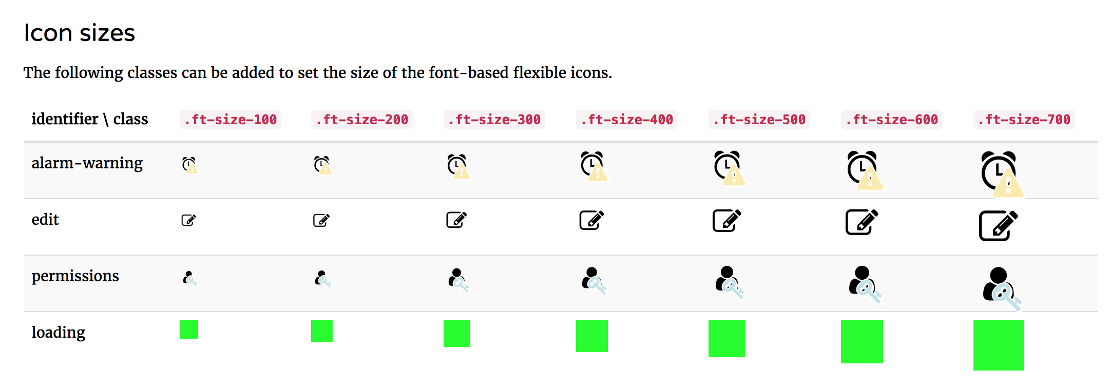
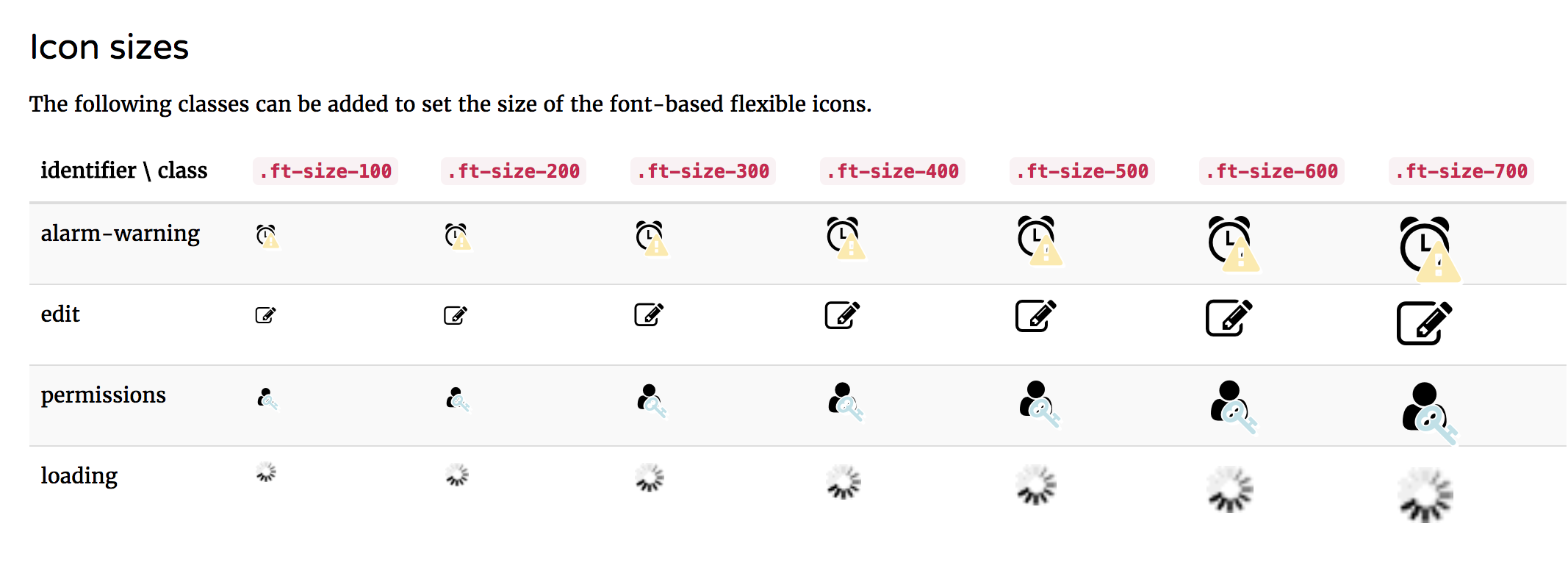
If we purge the caches we can navigate to the elementlibrary to check our styles are being applied by going to Site administration > Appearance > Themes > Element Library and access the Flexible icons page. We'll find some examples of the loading icon in the Icon sizes section.
Lastly we'll add a ruleset to specifically target our loader instance and apply the image. I've added a GIF at the path theme/kakapo/pix/loader_small.gif using the BEM style class I added in the flex_icons.php file unique to this icon instance and remove the lime debug code:
.image-icon {

	// Totara font icons are fixed-width
	// so use the same dimensions.
	display: inline-block;
    width: 1.3em;
	height: 1.3em;

	// Add some generic background positioning and
	// sizing rules to be used across all image-icons.
	background-position: center;
	background-repeat: no-repeat;
	background-size: @ft-size-100;

	// We ensure compatibility with all of the Totara
	// font-icon default implementation sizes.
	&.ft-size-200 {
    	background-size: @ft-size-200;
	}
	&.ft-size-300 {
    	background-size: @ft-size-300;
	}
	&.ft-size-400 {
    	background-size: @ft-size-400;
	}
	&.ft-size-500 {
    	background-size: @ft-size-500;
	}
	&.ft-size-600 {
    	background-size: @ft-size-600;
	}
	&.ft-size-700 {
    	background-size: @ft-size-700;
	}

 }

.image-icon--loading {
    background-image: url('[[pix:theme_kakapo|loading_small]]');
}
Purging the caches and refreshing the page we should see the updated image.
Of course because images don't scale like font-based icons or SVGs (it's possible to use the same technique above using an SVG based pix file without needing to worry about this final step) you'll likely want to add a separate, resized image for each of the sizes.
You could update the example above by adding an image for each .ft-size and apply it like:
.image-icon {
	// Let's give it a loud background while we develop
	// so it's easier to see the icon dimensions :)
	background-color: lime;

	// Totara font icons are fixed-width
	// so use the same dimensions.
	display: inline-block;
    width: 1.3em;
	height: 1.3em;

	// Add some generic background positioning and
	// sizing rules to be used across all image-icons.
	background-position: center;
	background-repeat: no-repeat;
	background-size: @ft-size-100;

	// We ensure compatibility with all of the Totara
	// font-icon default implementation sizes.
	&.ft-size-200 {
    	background-size: @ft-size-200;
	}
	&.ft-size-300 {
    	background-size: @ft-size-300;
	}
	&.ft-size-400 {
    	background-size: @ft-size-400;
	}
	&.ft-size-500 {
    	background-size: @ft-size-500;
	}
	&.ft-size-600 {
    	background-size: @ft-size-600;
	}
	&.ft-size-700 {
    	background-size: @ft-size-700;
	}

 }

.image-icon--loading {
    background-image: url('[[pix:theme_kakapo|loading_small]]');
	&.ft-size-200 {
		background-image: url('[[pix:theme_kakapo|loading_small-200]]');
	}
	&.ft-size-300 {
		background-image: url('[[pix:theme_kakapo|loading_small-300]]');
	}
	&.ft-size-400 {
		background-image: url('[[pix:theme_kakapo|loading_small-400]]');
	}
	// ...etc. up to .ft-size-700
}
This approach to creating icons means there is also the potential to provide legacy browser fallbacks (e.g. IE) for icons using CSS which was not previously possible.
Troubleshooting
When implementing your own sets of flexible icons don't forget that Totara's default icon set as well as providing size variants via .ft-size-XXX classes discussed above it also provides state based icon variants (see the ft-state-<state name> classes e.g. .ft-state-info) and LTR direction flipping (see the .ft-flip-rtl class).