Performance activity content element plugins
The performance activity section content is produced from a collection of different content type plugins, with the admin page essentially acting as a form builder. Each content plugin can either be 'respondable' or 'non-respondable'. Respondable plugins are questions where the user will be able to provide a response, have their response validated and stored, and allow for other users to see their response. Non-respondable plugins don't allow for the end user to provide any input, but instead provide meaningful information which may help while answering respondable questions.
Creating a custom-element sub-plugin
Server
- Create a sub-plugin on the following path: server/mod/perform/element/[your-sub-plugin]
If the new plugin type is respondable then extend the plugin class from the respondable_element_plugin class:
class your_sub_plugin extends respondable_element_plugin {

    public function validate_response(
        ?string $encoded_response_data,
        ?element $element,
        $is_draft_validation = false
    ): collection {
		....
    }
}
If the new plugin type is non-respondable then extend the plugin class from the element_plugin class:
class your_sub_plugin extends element_plugin {

	public function has_title(): bool {
     ....
	}
}
Each element type can define if it's able to be used as a sub-element of other elements. The default is yes. If you want to prevent that, you can override the get_element_usage() method in your plugin class:
class your_sub_plugin extends element_plugin {
    [...]
    public function get_element_usage(): \mod_perform\models\activity\helpers\element_usage {
        return new \your_sub_plugin_namespace\element_usage(); // Extend the base element_usage class to define usage settings.
    }
}
Each sub-plugin can define corresponding Vue component to define the sub-plugin view when creating elements and user responses:
class your_sub_plugin extends element_plugin {

   public function get_admin_edit_component(): string {
	// Default
	//return $this->get_component_path('AdminEdit');
    ...
   }

   public function get_admin_view_component(): string {
	// Default
	// return $this->get_component_path('AdminView');
    ...
   }

   public function get_admin_summary_component(): string {
	// Default
	// return $this->get_component_path('AdminSummary');
    ...
   }

   public function get_participant_form_component(): string {
	// Default
	// return $this->get_component_path('ParticipantForm');
    ...
   }

   public function get_participant_print_component(): string {
	// Default
	// return $this->get_component_path('ParticipantPrint');
    ...
   }
}
Client Vue components
Each element sub-plugin needs to provide components for the following views:
- Admin view
- Admin edit
- Admin summary
- Participant form
- Participant print
Creating admin edit component
This is the admin creation form for the element, used when including the element in an activity section:
Add the component on the following path: client/component/[your_sub-plugin]/src/components/[your_sub-plugin]AdminEdit.vue
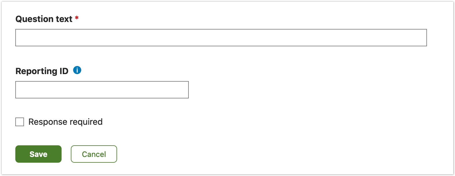
There is a form helper component that provides the common fields (title, reporting id, is required and Save / Cancel buttons).
    <PerformAdminCustomElementEdit
      :initial-values="initialValues"
      :settings="settings"
      @cancel="$emit('display')"
      @update="$emit('update', $event)"
    >
		<!-- Slot for any additional fields -->
	</PerformAdminCustomElementEdit>
This component is provided with a settings prop which can be directly passed to the PerformAdminCustomElementEdit component. The settings object is provided by the original apollo query and controls the following:
- Has a title field
- Has title help text
- Has a reporting id field
- If the title is required
- If the field is respondable (has a required checkbox)
- If the required checkbox is enabled
The initialValues object is used to populate the initial form values, and needs to be manually constructed from the rawData prop values. The values in the following code block will always need to be provided:
data() {
	return {
		initialValues: {
			rawTitle: this.rawTitle,
			identifier: this.identifier,
			responseRequired: this.isRequired,
		},
	};
},
Adding additional form fields
- Any additional form fields or content can be added to the PerformAdminCustomElementEdit slot.
- This component will have to handle validation for the additional fields. PerformAdminCustomElementEdit emits a change event which can be used for updating complex validation values.
- This component will also have to populate the initial values for additional fields. This is done by appending the values to the initialValues object. Previously stored values are available from the data prop.
Creating admin view component
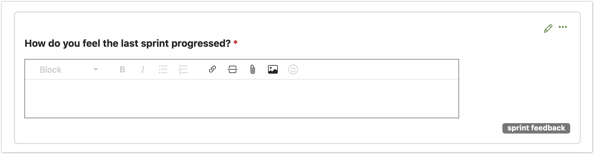
The admin preview provides a basic impression of how the component interface will look once added to the section, rather than being identical to the participant-facing component.
Add the component on the following path: client/component/[your_sub-plugin]/src/components/[your_sub-plugin]AdminView.vue
As this component is just for visual feedback, no form validation is required. Any additional content added in the adminEditView step is available in the data prop.
Creating admin summary component
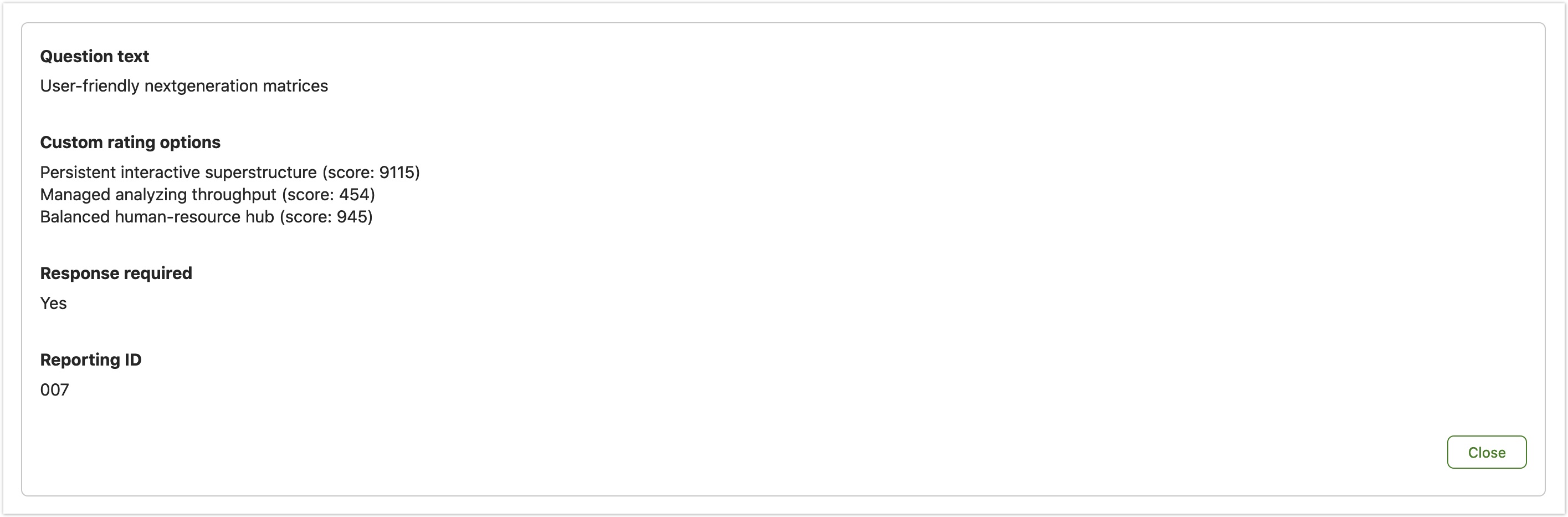
The admin summary view is available once an activity is active, and the edit view is no longer available.
Add the component on the following path: client/component/[your_sub-plugin]/src/components/[your_sub-plugin]AdminSummary.vue
There is a PerformAdminCustomElementSummary helper component which generates the output for the standard form elements and accepts an extra-fields prop for the output of custom fields.
<PerformAdminCustomElementSummary
	:extra-fields="extraFields"
	:identifier="identifier"
	:is-required="isRequired"
	:settings="settings"
	:title="title"
	@display="$emit('display')"
/>
Creating participant form component
This is the form input the participant will see.
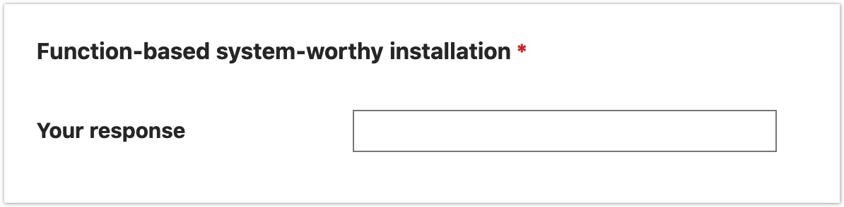
Add the component on the following path: client/component/[your_sub-plugin]/src/components/[your_sub-plugin]ParticipantForm.vue
This component should be wrapped within the ElementParticipantFormContent component.
The ElementParticipantFormContent component handles the different view switching (read only/ print/ form), populates form content (if editable), and displays others' responses.
This content will also need to be wrapped within a FormScope component, which will help handle validation for the input fields.
<ElementParticipantFormContent
	v-bind="$attrs"
	:element="element"
	:is-draft="isDraft"
>
	<template v-slot:content>
		<FormScope :path="path" :process="process">
			<!-- Form components / UI -->
		</FormScope>
	</template>
</ElementParticipantFormContent>
Creating participant print component
This is the print view of the participant form component. For some element sub-plugins this will be identical to the participant form component, and the server code can point to the same component.
Add the component on the following path: client/component/[your_sub-plugin]/src/components/[your_sub-plugin]ParticipantPrint.vue
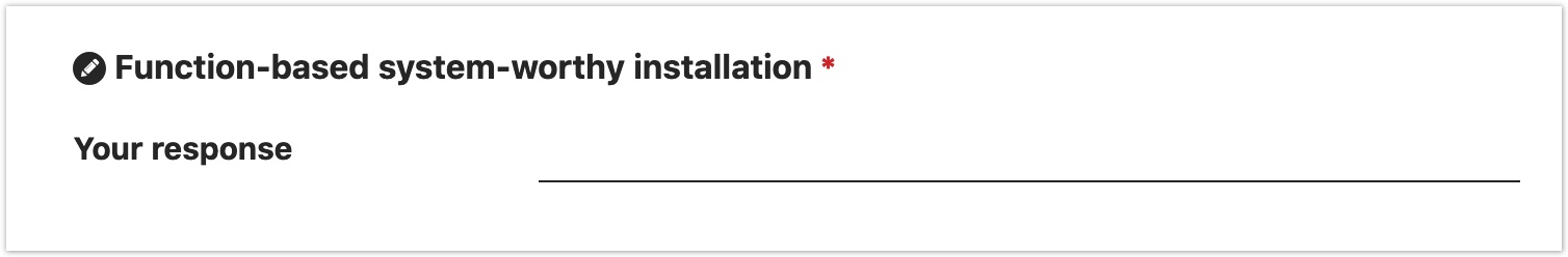
For printed elements where the user is expected to write text on paper there is a NotepadLines component, which takes an integer prop for the number of lines to output. NotepadLines should only be used when there is no existing input for the field.
<div>
	<div v-if="hasBeenAnswered">{{ data[0] }}</div>
	<NotepadLines v-else :lines="6" />
</div>